


Bali Arts Festival 2008- part 5
black and white
I did the calculations. I have 21 black and white pictures to date in my flickr account. That represents only 1.3% of my 1,655 photos (public and private).
So I prefer colors. The wilder, the better. The more vivid, the more attractive. There are occasions – and they come few and far between – when I see photos in b&w light and I would then convert the colored originals into b&w.
Such sentiment came to me with these portraits at the Bali Arts Festival Opening Parade. I can volunteer three reasons on the b&w decision.
1. First is to eliminate the distraction of color. B&W allows the eyes to focus on the subject and the prevailing mood of the composition. All the subjects are male and I felt that masculinity is served in strong contrasts and almost inscrutable shadows.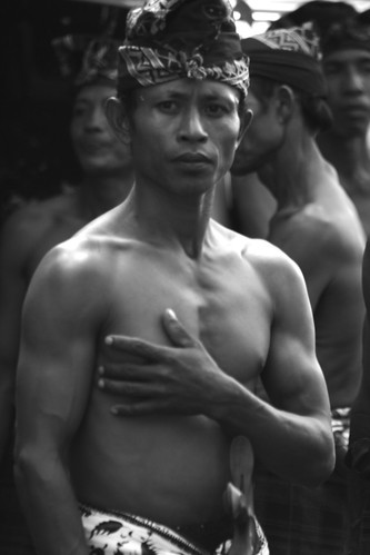
Canon EOS 350D Digital, 1/100s, f/5.0, 230mm, ISO 100, -1/3EV
2. Second is to recreate timelessness. Time was when b&w was the norm so monochromes evoke nostalgia like no other.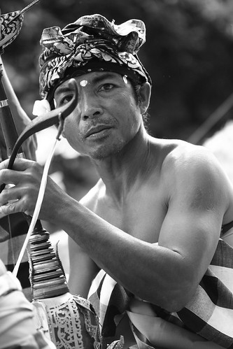
Canon EOS 350D Digital, 1/500s, f/2.8, 100mm, ISO 400, +1/3EV
3. Third is a reason that is innately Balinese. In the island’s Hindu culture, the combination of black and white, as evident in the ubiquitous poleng black and white checked cloths which are draped all over statues, pavilions and even trees, represents cosmic duality. Light and darkness could not be more universal and specific at the same time.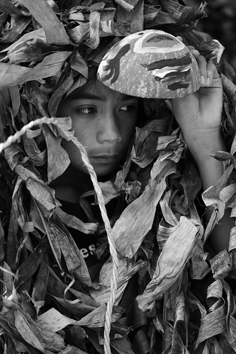
Canon EOS 350D Digital, 1/250s, f/2.8, 100mm, ISO 100, -2/3EV

3 comments:
I know what you're talking about - I'm the same, usually preferring color. But sometimes b&w is so much better....While in Singapore and Hong Kong two months ago I took a lot of photos inside several temples...the photos were very vivid in color but something felt just not right about them ... I converted them into black and whites and boom, suddenly they were so intense, so timeless and rich in meaning....
wow, great thoughts on B&W very succinct too. I agree with you. B&W allows for the form to be scene clearly and is very masculine. Color does distract from this....aaa....interesting how you say, color distracts from the subject, i never thought of it that way before but I agree. I think the fact that the sculptural form of the subject heightens awareness of the space and the figure and ground aspects. This also lends a Timeless feeling. I love what you are saying about the Balinese and it's Hindu roots and fascination/symbolizing of cosmic duality using black and white. That is very close to what i mean when I say B&W emphasizes the form and heightens awareness of the space too the figure and ground are seen more real and timeless.... The Bokeh effect we see used a lot seems to cause an awareness of space and distinguishes figure and ground - there is a timelessness in this effect too.... Very good thoughts and photos Farl ~ michael (Vertacordia)
Great idea. Thanks.
Post a Comment